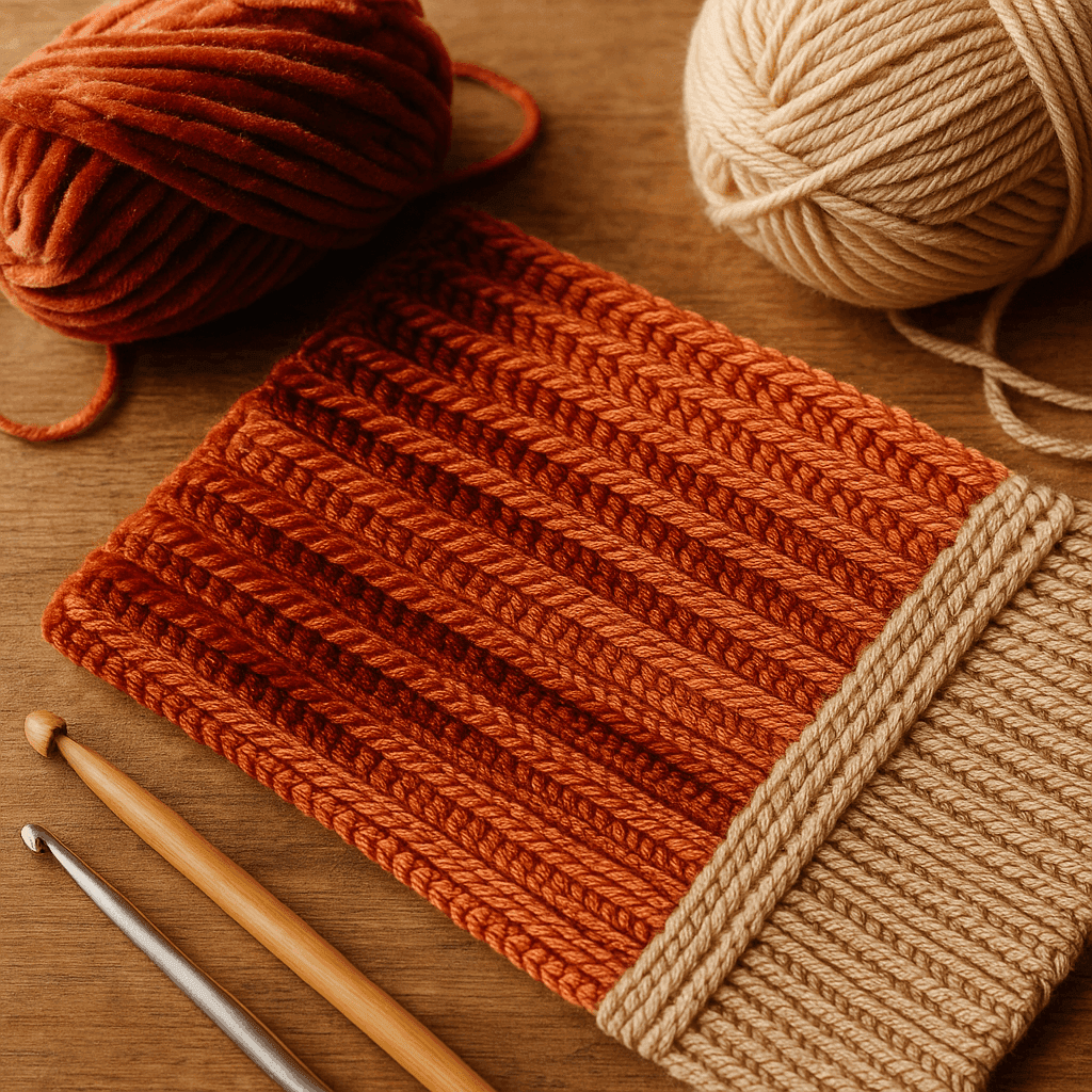
There is a particular moment many crocheters have had without quite naming it: you spread out two panels that were made from the same yarn, same hook, same stitch, and somehow they do not look the same. One catches the light and glows. The other looks slightly darker, flatter, or even as though the color changed. Sometimes the effect is beautiful and velvety. Sometimes it makes a carefully made sweater front and back look accidentally mismatched.
That visual shift is not your imagination, and it is not always a tension problem. It is often directional nap: the surface grain created by stitch orientation, loop selection, row path, yarn twist, and fiber luster. Once you begin seeing crochet fabric as a directional surface rather than a flat grid of stitches, an entirely new design tool opens up. You can create brushed-looking texture without brushing, velvet-like shading without pile, and subtle mirrored panels that look intentional instead of off.
This is where crochet starts behaving a bit like woven velvet, corduroy, brushed jersey, or even wood grain. Light does not just hit the color; it travels across the tiny slopes, ridges, loops, and twists on the fabric surface. Depending on the angle of the stitches and the shininess of the fiber, that surface may reflect light toward your eye or away from it. A fabric with strong directional grain can appear to shift tone when turned, worn, photographed, or blocked.
For garment makers, accessory designers, and anyone who loves texture, this is powerful information. It means you can engineer visual grain on purpose. It also means you can avoid the frustration of assembling pieces that were technically identical but optically different. In this guide, we will look at how directional crochet works, how to sample for it, which stitch structures exaggerate or soften it, how yarn choice changes the effect, and how to plan panel layout and finishing so the final result looks deliberate.
Understanding directional nap in crochet
In fabric terms, nap is the directional character of a surface. A napped fabric tends to look or feel different when stroked, tilted, or viewed from opposite directions. Crochet usually does not have a true cut pile unless you have added one, but it absolutely can develop a directional surface grain.
In crochet, that grain is usually created by several factors working together:
- The path of the working yarn through the stitch
- Whether you work through both loops, front loop only, or back loop only
- The angle of the top loops and post structures
- The direction of the row or round construction
- The orientation of slip stitches and short stitches
- The twist, ply, halo, and luster of the yarn
- How blocking or finishing sets the fabric
A matte, fuzzy wool in standard single crochet may barely show directional shading. A mercerized cotton slip-stitch fabric worked in one loop with a firm gauge can show striking light-dark changes depending on viewing angle. Rayon, bamboo, silk blends, and smooth acrylics often amplify these shifts because they reflect more light from the stitch ridges.
Directional nap is easiest to notice when:
- The stitch pattern creates pronounced ridges or aligned loops
- The yarn is smooth or lustrous
- The gauge is dense enough to hold a surface structure
- The light source is directional rather than diffuse
- Adjacent panels were worked in opposite directions or assembled with different stitch grain orientation
This is why a sweater made from top-down body pieces and side-to-side sleeves may show tonal changes even when all the yarn came from the same dye lot.
The optics: why the same yarn can look lighter or darker
Crochet surface optics are really about micro-topography. Every stitch is a tiny formed object with loops, bars, slopes, and valleys. Light striking those shapes can be:
- reflected directly back,
- scattered softly,
- absorbed by shadow between ridges,
- or redirected along the twist and sheen of the yarn.
A useful way to think about it is this: crochet stitches create countless tiny roofs and troughs. If those little roofs are angled toward the viewer, the fabric often looks brighter. If they angle away, the troughs cast more shadow and the fabric appears darker.
Fiber luster changes the strength of that effect:
- High-luster fibers like silk, rayon, bamboo, mercerized cotton, polished acrylic, and some nylon blends create stronger directional shine and more obvious color shift.
- Low-luster fibers like woolen-spun wool, alpaca with halo, matte cotton, rustic wool, and tweedy blends diffuse light more broadly, so the effect is softer.
- Halo fibers such as mohair, brushed alpaca, and fuzzy wool can blur stitch edges. This may reduce crisp reflected ridges but add a stroked-surface look, which is another kind of nap.
Ply matters too:
- Tightly plied smooth yarns show stitch grain clearly.
- Loosely plied yarns may flatten or bloom after blocking.
- Singles or low-twist yarns can produce a softer, brushed visual field, though they may pill or fuzz with wear.
Color matters, but not in the way people often assume. Very dark or highly saturated colors can show dramatic directional shading because the contrast between highlight and shadow is stronger. Pale colors show subtler shifts, unless the fiber is very shiny.
Which stitch structures create visual grain most effectively
Some crochet stitches are naturally more directional than others. If your goal is engineered nap, choose structures that align loops and ridges in a consistent path.
1. Slip stitch fabric
Slip stitch is one of the strongest tools for directional surface design. Because it is short, compact, and often ridge-forward, it creates a tidy surface with distinct loop alignment.
Particularly effective variations:
- slip stitch in back loop only
- slip stitch in front loop only
- yarn-over slip stitch and modified slip textures
- side-to-side slip stitch rib structures
Recommended hook and yarn pairing:
- DK weight yarn with a 3.5 to 4 mm hook
- Worsted weight yarn with a 4.5 to 5 mm hook
- For very dense reflective structure, go down 0.5 mm from your usual hook
Gauge note: Slip stitch compresses fabric. A 4 x 4 in (10 x 10 cm) swatch in worsted slip stitch may need 24 to 30 sts and 28 to 40 rows, depending on loop choice and yarn.
Because slip stitch stitches lean and stack in a very specific way, changing row direction or flipping panel orientation can dramatically alter the apparent sheen.
2. Single crochet through one loop
Single crochet in back loop only creates horizontal ridges with a hinged fold line. It is excellent for soft directional grain because the unworked loop sits on the surface.
Single crochet in front loop only creates a different surface emphasis, often exposing the back ridge and changing the angle of reflected light.
Recommended hook and yarn pairing:
- Sport or DK yarn with a 3.75 to 4.5 mm hook
- Worsted yarn with a 4.5 to 5.5 mm hook
Typical dense swatch estimate:
- Worsted weight, 5 mm hook: 14 to 16 sc x 16 to 18 rows = 4 in if worked through both loops
- Through one loop, row depth and surface ridge can make the fabric appear slightly more compressed or elastic
3. Half double crochet in the third loop
Half double crochet worked into the third loop places the top V forward and creates horizontal bars. This can look almost knit-like and catches light in broad bands.
This is especially effective in mercerized cotton or smooth wool blends when worked flat and then mirrored intentionally for garments.
Typical swatch estimate:
- DK yarn, 4.5 mm hook: 16 to 18 hdc x 11 to 13 rows = 4 in
4. Post stitches and raised ribs
Front post and back post stitches create stronger shadows than loop-only work. They are excellent when you want unmistakable directional texture, though the effect is more architectural than velvety.
5. Tunisian-inspired or elongated loop textures
Though not strictly standard crochet nap, elongated loops, surface slip lines, and compact Tunisian-like textures can produce striped reflectance. If your design goal is grain rather than puff, keep the structure aligned and repetitive.
Front loop, back loop, and surface path: what actually changes
When you choose front loop only or back loop only, you are not just changing stretch. You are changing which part of the stitch sits proud on the surface and which part recedes. That changes the light path.
Back loop only (BLO)
In rows worked flat, BLO tends to push the unused front loop toward the fabric face, often creating a visible ridge line. The hinge created at the back loop can make each row tilt slightly. The result is a directional corded surface.
Use BLO when you want:
- ribbed grain
- soft fold lines
- shadow bands
- a fabric that changes tone when viewed from above vs below
Front loop only (FLO)
FLO shifts the structural emphasis differently. Depending on stitch type, it can expose back ridges and create a flatter or more undercut face. On shiny yarns, FLO can produce a surprising satiny line because the remaining bars catch light cleanly.
Use FLO when you want:
- a more delicate directional surface
- a pronounced line on the reverse or edge
- layered effects combined with surface crochet or later passes
Both loops
Working through both loops generally stabilizes the stitch and reduces exaggerated directional grain, but does not eliminate it. Stitch lean, row direction, and yarn luster still matter.
Row direction and mirrored construction
This is one of the most important practical issues in directional crochet design. Two pieces can be crocheted from the same pattern and still display opposite optical grain if they were worked from opposite edges or flipped during assembly.
This matters most for:
- sweater fronts n- sleeve pairs
- cardigan bands
- bag panels
- pillow fronts and backs
- patchwork garments
When worked flat, crochet rows alternate direction. However, the visual face of the stitch structure can still have a dominant grain depending on where turns happen, how decreases are made, and whether one-loop or slip-stitch methods are used.
For mirrored garment pieces, you need to decide whether you want:
- Matched grain: both left and right pieces reflect light the same way when worn.
- Mirrored grain: left and right pieces intentionally angle reflections toward the center or away from it.
Both can be beautiful. Accidental inconsistency is the problem.
Planning matched grain
To make two panels look optically similar:
- Work them from the same edge orientation.
- Keep the public-facing side consistent.
- Mark the right side with removable markers.
- Record whether row 1 began at hem, cuff, center front, or side seam.
- Before seaming, lay panels side by side under directional light and compare.
Planning mirrored grain
To make the effect symmetrical on purpose:
- Crochet one panel as written.
- Crochet the second as a true mirror if needed, not just another identical copy.
- Check whether the brighter-facing ridge should tilt inward or outward.
- Use mirrored shaping and mirrored stitch placement if the pattern includes one-loop ridges or slip columns.
A useful habit is to label swatches or panels with arrows showing crochet direction, top edge, and right side.
Sampling method: a practical test swatch for directional nap
Before committing to a full garment, make a diagnostic swatch. This is the fastest way to see whether your yarn and stitch combination produce strong visual grain.
Directional nap test swatch
Materials
- 25 to 40 g of your chosen yarn
- Hook size appropriate to yarn, plus one size smaller and one size larger
- Locking markers
- Notebook or phone camera
Suggested setup
- Chain 31 with worsted or DK yarn
- This gives a manageable swatch width for observing reflectance changes
Section plan
- Rows 1-8: single crochet through both loops, 30 sc
- Rows 9-16: single crochet BLO, 30 sc
- Rows 17-24: single crochet FLO, 30 sc
- Rows 25-32: slip stitch BLO, 30 sl st
- Rows 33-40: half double crochet in third loop, 30 hdc
Basic counts
- Start with ch 31
- Row 1: sc in 2nd ch from hook and in each ch across, 30 sc, ch 1, turn
- Continue each section maintaining 30 sts
What to observe
- Which section looks lighter when viewed from the bottom edge upward?
- Which section looks darker when the swatch is rotated 180 degrees?
- Which section changes most under side light?
- Which section feels smoothest when stroked upward vs downward?
- Does blocking soften or sharpen the effect?
Take photos in three conditions:
- front-lit daylight
- side-lit lamplight
- overhead diffuse light
Rotate the swatch between photos. This gives more objective evidence than looking quickly in your lap.
Step-by-step: designing a crochet fabric with intentional directional grain
Here is a working process you can use whether you are designing a scarf, sweater, pillow, or bag.
Step 1: Define the visual goal
Ask yourself what kind of directional effect you want:
- subtle tonal drift
- strong velvet-like light/dark reversal
- brushed horizontal banding
- corded vertical grain
- mirrored panel shimmer
If you want a quiet effect, choose matte yarn and one-loop single crochet or hdc third loop. If you want drama, choose a smooth lustrous yarn and slip stitch or compact loop-path texture.
Step 2: Choose yarn by luster and ply
Use this quick decision guide:
- For crisp shine: mercerized cotton, bamboo blend, silk blend, smooth acrylic, polished wool blend
- For soft grain: standard wool, superwash merino, matte cotton
- For brushed nap look: halo yarn, low-twist wool, alpaca blend
Recommended yarn weights
- Fingering: best for refined, delicate directional texture
- DK: excellent balance of drape and visible grain
- Worsted: easiest for sampling and visible surface structure
- Bulky: can show dramatic ridges, but may become too sculptural rather than velvety
Step 3: Select stitch structure and hook size
For stronger grain, work at a firm but not stiff gauge. Too loose and the surface collapses; too tight and the fabric may buckle.
A good starting point:
- DK yarn: try 4 mm for sc BLO, 3.75 mm for slip stitch BLO
- Worsted yarn: try 5 mm for sc BLO, 4.5 mm for slip stitch BLO
Make at least two swatches with hooks 0.5 mm apart.
Step 4: Determine panel orientation
Sketch the finished piece and draw arrows showing row direction. This is crucial.
For a pullover, mark:
- body front: hem to shoulder, or side to side?
- body back: same or different?
- sleeves: cuff to cap, cap downward, or side to side?
- collar or bands: around neckline, vertical, or horizontal?
If grain consistency matters, align the most visible areas:
- front body and sleeves visible from the front should often share compatible grain
- side panels can shift direction if framed intentionally
- pockets should either match the panel beneath or contrast clearly on purpose
Step 5: Swatch seam tests
Make two mini panels and seam them as your project will be seamed. Put them under light and check whether the seam makes the grain look broken.
Sample seam test:
- Chain 21
- Work 16 rows in chosen stitch, 20 sts each row
- Make two identical rectangles
- Join them using mattress seam, slip seam, and single crochet seam on separate edges if possible
Observe whether the seam ridge interrupts reflectance or helps define the grain. Sometimes a visible seam actually improves the look by acknowledging the direction change.
Step 6: Build shaping with optical awareness
Decreases and increases can distort grain. In directional fabrics, scattered shaping may show more obviously.
Strategies:
- Place increases at edges where possible
- Use paired mirrored decreases for garment fronts
- Avoid abrupt random shaping in highly reflective stitch patterns
- Consider short-row shaping if it preserves the surface path better than edge carving
Step 7: Block, rest, and reassess before final assembly
Directional surfaces often shift after washing or steaming. Always treat your swatch exactly as the final item will be treated.
Measure before and after blocking:
- stitch gauge
- row gauge
- width and height
- visual grain intensity
Write it down. A swatch that had dramatic ridges before blocking may flatten significantly, especially in cotton or bamboo.
Garment placement: where directional grain works best
Directional nap is most successful when used with body lines rather than against them.
Vertical grain
Created by side-to-side ribbed construction, vertical slip ridges, or columns of raised texture.
Best for:
- elongating the torso
- sleeve slimming effects
- long scarves
- cardigan fronts
Horizontal grain
Created by row-wise loop ridges, hdc third-loop bands, and BLO fabrics worked bottom-up.
Best for:
- yokes
- cuffs and hems
- structured crops
- pillows and blankets where broad banding is desired
Mirrored center emphasis
If left and right fronts angle their brightest reflectance toward the center opening, a cardigan can look intentionally sculpted. If they angle away, the front may appear to widen. Neither is wrong, but decide intentionally.
High-movement areas
Directional surfaces can become visually inconsistent where the fabric stretches repeatedly:
- elbows
- seat area
- underarms
- pocket openings
In these areas, choose a more forgiving matte fiber or a stitch that recovers well after wear.
Color behavior on shiny vs matte fibers
The same stitch pattern can produce very different color effects depending on the fiber finish.
Shiny fibers
On silk, rayon, bamboo, mercerized cotton, and sleek acrylic, directional nap can create:
- apparent tonal striping
- shadow pooling across ridges
- bright-hot highlights on fold lines
- a color shift that looks like one shade lighter or darker from angle changes
This is beautiful, but it can emphasize mismatched panel orientation quickly.
Matte fibers
On wool, rustic blends, and soft matte cotton, the grain is usually subtler. You may see:
- soft suede-like depth
- gentle row shadowing
- less dramatic color reversal
Heathered, marled, and tweed yarns
These can either enrich or confuse directional effects.
- Heathering often softens hard shine lines.
- Marls can exaggerate row-by-row path if one color rides the surface more strongly.
- Tweed neps break up light reflection and may hide grain changes.
If using hand-dyed yarn, sample carefully. Reflectance plus tonal variation can create striking complexity, but also make shaping lines harder to read.
Blocking effects on nap
Blocking does not just change size. It changes surface geometry.
Wet blocking
Wet blocking usually relaxes the yarn and can soften pronounced ridges, especially in wool and superwash fibers. Cotton may flatten and spread, changing how surface bars catch light.
Steam blocking
Steam can set surface direction quickly, but be careful with acrylic and shiny fibers. Too much steam can collapse the crispness that made the grain visible.
Brush and bloom
Some fibers develop more apparent nap after washing because they bloom slightly. Wool, alpaca, and brushed fibers can gain a suede-like look as the surface fuzz rises and softens stitch edges.
Best practice
Always block one swatch lightly and another fully. Compare.
Record:
- pre-block stitch count over 4 in
- post-block stitch count over 4 in
- pre-block row count over 4 in
- post-block row count over 4 in
- visual rating of grain from 1 to 5
That little bit of disciplined sampling saves a surprising amount of disappointment later.
Finishing strategies to keep directional crochet looking intentional
Finishing is where many beautiful directional projects either become polished or accidentally muddled.
1. Keep right side and top edge marked
Use locking markers on every panel:
- one marker for right side
- two markers for top edge
- optional arrow tag for crochet direction
Do not rely on memory once the pile of pieces grows.
2. Lay out all pieces before seaming
Place panels on a flat surface under side light. Walk around them. Rotate if needed. Compare front body, back body, sleeves, collar, cuffs, and pocket pieces before joining.
3. Match or intentionally contrast
If one piece reflects differently, decide:
- Can you rotate or flip it to match?
- If not, can you use it as a mirrored feature?
- Would adding a border or seam line make the shift look framed rather than mistaken?
4. Use finishing lines strategically
Surface slip stitch, narrow applied borders, or visible joins can visually reset the eye between directional areas. This is especially useful where sleeves join body panels with different grain paths.
5. Be careful with pressing
Flattening ridges too aggressively can erase directional texture in one area but not another. Treat all pieces consistently.
6. Consider lining or interfacing for bags
For bags and pouches, directional grain can distort when the fabric stretches under weight. A lining helps preserve the engineered surface effect.
Common mistakes and how to fix them
Directional crochet is rewarding, but it reveals inconsistency quickly. Here are the issues I see most often.
Mistake 1: Panels look different even though stitch counts match
Symptoms: front panel appears darker than back, or one sleeve looks shinier.
Cause: opposite grain orientation, flipped right/wrong side, or different row path.
Fix:
- Compare pieces under directional light.
- Try rotating or flipping before seaming.
- If not possible, add a visible seam or border and treat them as mirrored design features.
- For future projects, label all panels with direction arrows.
Mistake 2: The nap effect disappears after blocking
Symptoms: beautiful ridges in the swatch flatten after washing.
Cause: loose gauge, soft yarn memory, or over-blocking.
Fix:
- Reswatch with a hook 0.5 mm smaller.
- Choose a smoother, more resilient yarn.
- Block to measurements without overstretching.
- Use a stitch with stronger structure, like slip stitch BLO instead of sc BLO.
Mistake 3: Fabric looks unintentionally stripy
Symptoms: reflective bands distract from the design.
Cause: strong luster paired with highly aligned ridges.
Fix:
- Switch to a more matte fiber.
- Blend directional sections with through-both-loops sections.
- Use heathered or lightly textured yarn to diffuse the highlights.
Mistake 4: Shaping disturbs the grain visibly
Symptoms: bust shaping, sleeve cap shaping, or neckline decreases create odd light patches.
Cause: decreases interrupt ridge alignment.
Fix:
- Move shaping to seams where possible.
- Use mirrored decreases consistently.
- Hide shaping inside borders, panels, or underarms.
- Try short rows instead of frequent edge cuts.
Mistake 5: Surface orientation feels rough one way and smooth the other
Symptoms: fabric behaves like a brushed textile.
Cause: this is normal directional nap, especially in slip stitch and one-loop textures.
Fix:
- Decide which direction should be “with the nap” and keep all visible pieces aligned.
- Mention care direction if selling or gifting a special item.
Mistake 6: Seam makes the grain look broken
Symptoms: joined pieces look mismatched even when fabric is similar.
Cause: seam bulk interrupts reflectance.
Fix:
- Test mattress seam for flatter joins.
- Use a decorative join to frame the transition.
- Align row valleys to row valleys rather than forcing ridge-to-ridge mismatch.
Design variations to explore
Once you understand directional grain, there are many creative directions to take.
Velvet-look scarf
Use DK mercerized cotton or bamboo blend, 3.75 to 4 mm hook, slip stitch BLO worked lengthwise.
- Chain to desired scarf length, for example ch 241 for approximately 72 in depending on gauge
- Work 12 to 18 rows of BLO slip stitch
- Keep stitch count constant each row
- Finish with a narrow single crochet border
The long lengthwise ridges will catch light beautifully and look almost brushed.
Mirrored cardigan fronts
Work left and right fronts with intentional mirrored grain so the sheen angles toward center front.
- Mark each panel’s top, outer edge, and right side
- Keep shoulder shaping mirrored, not copied blindly
- Add a front band to frame the directional shift
Panel-play pillow cover
Join four rectangles with alternating grain direction for a quilted-light effect.
Suggested panel size:
- each panel 20 sts x 28 rows in sc BLO using worsted yarn and 5 mm hook
- make gauge adjustments to fit pillow form
Matte-and-shine striping
Alternate sections of matte wool and mercerized cotton in the same color family. The difference in luster alone creates a sophisticated tonal pattern even if the hue is similar.
Brushed-surface hat band
Use BLO single crochet or slip stitch for the band only, then switch to a less directional stitch for the hat body. This gives the pleasure of directional texture without risking mismatched crown shaping.
A practical checklist before starting a major project
Use this checklist if you want your directional crochet to read as intentional and refined.
- Have I identified whether the yarn is matte, shiny, smooth, fuzzy, or haloed?
- Have I tested at least two hook sizes?
- Did I compare front loop, back loop, and both-loop versions?
- Did I photograph the swatch from more than one angle?
- Did I wash and block the swatch?
- Did I mark right side, top edge, and crochet direction?
- Did I sketch panel layout and seam placement?
- Do I want matched or mirrored grain on paired pieces?
- Did I sample a seam?
- Did I account for how shaping affects reflectance?
If you can answer yes to most of these, you are designing the fabric rather than merely producing it.
Key takeaways
Directional nap in crochet is one of those advanced ideas that immediately explains many “mystery” fabric behaviors. The same yarn can look lighter, darker, shinier, duller, smoother, or rougher depending on stitch orientation, loop path, row direction, and fiber luster. Once you understand that, you gain enormous control.
The essential principles are simple:
- Surface grain is real in crochet.
- One-loop stitches and slip stitches amplify it.
- Smooth, lustrous yarns show it more clearly than matte, fuzzy yarns.
- Panel orientation matters just as much as stitch count.
- Blocking can either soften or set the effect.
- Finishing decisions can turn mismatch into design.
Most importantly, sample with intention. A 30-stitch swatch under a lamp can teach you more about your project’s final appearance than pages of pattern math. Notice which way the fabric glows, which way it shadows, and whether paired pieces need matching or mirroring.
That is the heart of engineering directional crochet: treating stitch surfaces as a designed landscape for light. When you do, crochet stops being only structure and color. It becomes grain, sheen, shadow, and motion—an optical fabric you can shape on purpose.