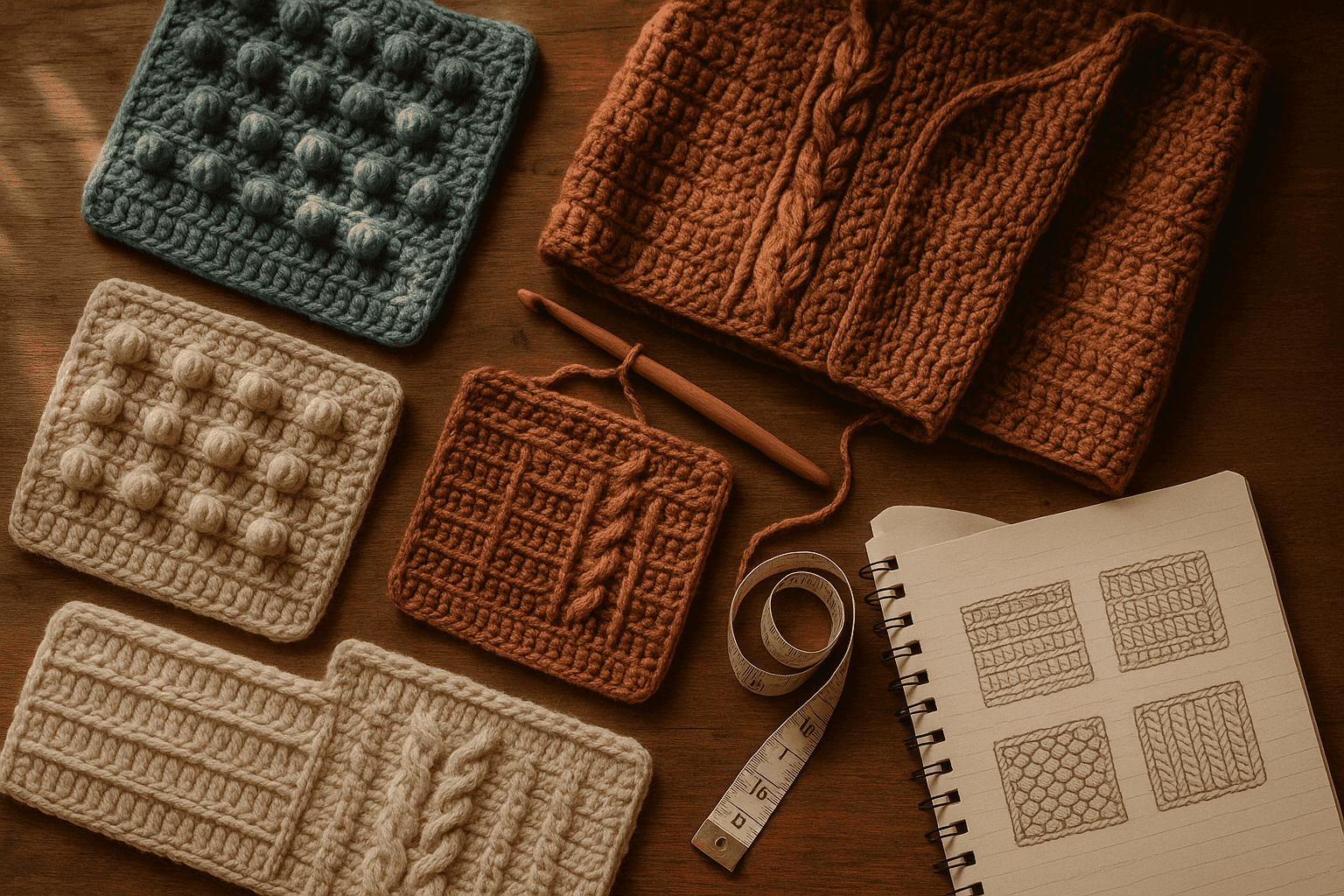
You know the moment: a texture swatch on your table looks absolutely perfect. The bobbles pop, the recessed background falls away just enough, and every line of the motif reads clearly when you tilt it toward the light. Then you scale it up into a yoke, a pillow front, or the body of a cardigan—and suddenly the design that felt crisp and sculptural in your hand starts looking busy, flat, or oddly indistinct from even a few steps away.
That disconnect is one of the most common and least talked-about challenges in textured crochet design. We spend a lot of time choosing beautiful stitch patterns, but not always enough time calibrating how those textures behave across a larger field, on a three-dimensional object, in real yarn, under real light, and at the distance from which a garment or home textile is actually seen. A swatch is viewed close up. A sweater is read from across the room.
That is where surface calibration comes in.
When I talk about crochet surface calibration, I mean the deliberate balancing of three key visual forces:
- Relief height: how far a textured stitch rises above or sinks below the surrounding fabric
- Shadow depth: how strongly valleys and ridges create visible light-dark separation
- Fiber reflectance: how much the yarn absorbs, diffuses, or reflects light through halo, sheen, twist, and surface smoothness
If those three forces support each other, your cables stay architectural, your florals stay recognizable, and your geometric fields remain legible at garment scale. If they fight each other, the same motif can turn muddy, noisy, or visually tiring.
This article is a technique-deep guide to designing texture that survives the journey from swatch to finished object. We’ll look at how bobbles, puffs, post-stitch ridges, recessed grounds, yarn halo, luster, color value, and viewing distance interact; how to map relief and test scale; and how to make smart decisions about fiber, gauge, shaping, and finishing so your texture remains readable whether you’re making a sweater, hat, cushion, or throw.
Why texture readability changes when you scale up
A swatch gives you information, but it does not tell the whole story. Usually, a swatch is:
- viewed from 12–18 inches away
- held flat in the hand
- lit from one side or above
- isolated from shaping and seams
- surrounded by visual empty space
A finished piece is different. It may be:
- viewed from 4–10 feet away
- curved over the body or furniture
- interrupted by increases, decreases, armholes, necklines, and hems
- layered over clothing or seen in motion
- affected by drape, blocking, and gravity
At close range, even subtle relief reads as “texture.” At distance, the eye stops parsing small events individually and starts grouping them into larger masses of light and dark. That means a textured design has to do more than exist—it has to create a coherent visual pattern at the scale at which it will be seen.
This is why a delicate puff-and-chain floral that looks exquisite in a 5-inch swatch can disappear on a 42-inch sweater body, while a bold post-stitch cable in a smooth wool can stay visible from several yards away.
The practical lesson is simple: texture readability is a scale problem as much as a stitch problem.
The three-part calibration model
Let’s break the surface down into the three variables you can control.
1. Relief height
Relief height is the physical rise or recession of the stitch pattern.
Examples of higher relief textures:
- bobbles n- popcorns
- layered puff stitches
- front-post cable crossings
- raised slip-stitch overlays
Examples of lower relief textures:
- subtle front/back loop patterning
- lightly ridged half double crochet variations
- shallow post-stitch ribs
- dense stitch changes in the same plane
As a rule, the larger the finished object and the greater the expected viewing distance, the more helpful it is to have a clearly differentiated relief profile.
That does not always mean “make everything taller.” Extremely high relief can become heavy, distort gauge, catch wear, and make drape collapse. It means the textured motifs need enough height difference from the background to remain distinct after blocking, handling, and use.
A practical way to think about this is in layers:
- Primary relief: the main motif, such as a cable, bobble line, petal cluster, or raised geometric track
- Secondary relief: supporting ridges or inner details
- Ground plane: the recessed or flatter background that allows the motif to stand out
If all three layers sit too close together in height, the eye reads “all texture, no hierarchy.” If the primary relief rises clearly above a quieter ground, the motif reads faster and more cleanly.
2. Shadow depth
Shadow depth is what turns physical relief into visible contrast.
A motif can be physically raised, but if the yarn’s surface diffuses light heavily—or if the stitch density is too open to create recessed channels—the shadows may be too soft to define the shape. Likewise, a flatter stitch pattern in a matte yarn with firm structure can sometimes read better than a puffier stitch in a fuzzy, reflective yarn.
Shadow depth depends on:
- depth of the valleys around raised stitches
- angle and frequency of ridges
- stitch density and openness
- firmness of fabric
- lighting conditions in normal use
Textures that rely on troughs and ledges tend to read best. Front-post cables over a dense background work because the cable rises while the background recedes, creating a clear edge. Deeply packed bobbles over a loose mesh may not read as well because the shadows break apart and the silhouette feels irregular.
3. Fiber reflectance
Fiber reflectance is the way yarn handles light.
This includes:
- luster: silk, bamboo, tencel, mercerized cotton reflect more light
- matte absorption: woolen-spun, non-mercerized cotton, rustic wool absorb and soften light
- halo: alpaca, mohair, brushed fibers blur stitch edges
- twist and ply definition: high-twist yarns sharpen edges; low-twist yarns soften them
Reflectance can either sharpen or muddy texture.
- A smooth matte wool often gives excellent texture readability because it holds shape and allows shadows to remain visible.
- A shiny mercerized cotton can make stitch architecture very crisp up close, but under bright light may reflect across the surface and flatten shadow contrast.
- A halo-rich alpaca blend can make even strong post stitches look fogged over from a distance.
So when you select yarn for texture, ask not only “Does this feel nice?” but “How clearly does this fiber let edges, ridges, and recesses show?”
Relief mapping: designing texture as topography
One of the most useful design habits for complex textured crochet is to stop thinking only in stitch symbols and start thinking in surface topography.
Before crocheting the full piece, sketch or chart the texture in terms of relief zones:
- high points
- medium points
- recessed points
- neutral resting areas
You can do this on graph paper, in a digital chart, or even with colored pencils. Assign each category a value:
- 3 = highest relief
- 2 = moderate relief
- 1 = low relief
- 0 = background recess
Then map the motif across the actual garment area.
For example, imagine a floral panel on a pullover front:
- flower centers = 3
- petals = 2
- connecting stems = 1
- background linen-like fabric = 0
This simple exercise reveals problems quickly:
- Are there too many high-relief elements clustered together?
- Does the motif have enough negative space around it?
- Do supporting lines disappear because they sit too close in height to the ground?
- Will side shaping cut through the motif’s highest-relief areas?
Relief mapping helps you establish hierarchy, and hierarchy is what readability depends on.
Swatch testing for scale, not just gauge
Most crocheters are good about making gauge swatches. Fewer of us make readability swatches. For textured work, you need both.
Minimum swatch sizes for texture testing
For a simple texture repeat, make at least:
- 6 x 6 inches / 15 x 15 cm for accessories
- 8 x 8 inches / 20 x 20 cm for garments
- 10 x 10 inches / 25 x 25 cm or larger for complex allover motifs or home textiles
A 4-inch swatch often isn’t large enough to tell you whether texture masses together or stays distinct.
What to record on the swatch
Label each swatch with:
- yarn brand and fiber content
- yarn weight
- hook size
- stitch and row counts over 4 inches / 10 cm
- blocked and unblocked measurements
- subjective notes: crisp, soft, haloed, shadowy, flat, busy, sculptural
For garment-scale texture, also count motif dimensions:
- motif width in stitches
- motif height in rows
- spacing between motifs
- width of recessed channels
For example:
- 22 sts and 18 rows = 4 inches in textured pattern with worsted wool and 5 mm hook
- central cable = 8 sts wide
- recessed background between cables = 6 sts
- cable crossing repeat = every 8 rows
Those numbers matter because readability often depends on the ratio between motif width and background width.
The distance test
Here is the most important part: put the swatch down and walk away.
Test it at:
- 2 feet
- 4 feet
- 6 feet
- 8 feet
If it is for home decor, also test it draped vertically and laid flat. If it is for a garment, pin or clip it onto a shirt, dress form, or hanger to simulate curvature.
Ask:
- Is the motif still recognizable?
- Do the outlines stay clear?
- Are the recessed areas dark enough to separate the raised areas?
- Does the whole thing merge into one visually noisy field?
Take photos in grayscale. This is an old visual-design trick and it is incredibly useful. Removing color helps you judge whether the texture has enough value contrast from light and shadow alone.
Stitch families and how they read at scale
Different textured stitches create different kinds of visibility. Knowing their strengths helps you choose wisely.
Bobbles and popcorns
Best for: dotted motifs, berries, floral centers, playful sculpted fields
Strengths:
- strong point-based relief
- visible from multiple angles
- useful as focal accents
Weaknesses:
- can read as clutter if overused
- may distort surrounding fabric
- often lose definition in fuzzy yarns
Calibration tips:
- Space bobbles with at least 1–3 grounding stitches between them, depending on yarn bulk.
- Use a firm background like single crochet or half double crochet rather than a loose chain mesh if you want strong shadow.
- For adult garment fronts, bobbles often read best when used in grouped motifs rather than allover dense fields.
Example starting gauge:
With DK yarn and a 4 mm hook, a bobble field over single crochet might give around 20–22 sts and 22–24 rows = 4 inches. Always swatch your actual bobble pattern because relief stitches consume yarn and alter row height.
Common mistake: Bobbles packed too closely in soft yarn create a lumpy but visually indistinct surface.
Fix: Increase spacing, drop hook size by 0.5 mm for the background only if your method allows, or switch to a smoother yarn with more ply definition.
Puff stitches
Best for: petals, clouds, soft sculpted motifs, romantic or organic texture
Strengths:
- rounded, plush relief
- can create beautiful petal geometry
- visually soft and dimensional
Weaknesses:
- edges are less crisp than popcorns or cables
- high yarn consumption
- can collapse after washing if worked loosely
Calibration tips:
- Use puffs where soft edges are desirable, not where razor-sharp geometry is required.
- Keep the background slightly recessed and denser than you think you need.
- Test blocked and washed samples; puffs change dramatically depending on fiber memory.
Common mistake: Puffy motif on puffy background, resulting in no clear hierarchy.
Fix: Build contrast by placing puffs over a flatter stitch such as single crochet, extended single crochet, or linked stitches.
Post-stitch ridges and cables
Best for: vertical architecture, braided motifs, geometrics, framed panels, classic garment texture
Strengths:
- excellent readability at distance
- clear linear shadows
- strong hierarchy when paired with recessed grounds
Weaknesses:
- can pull fabric inward
- may become stiff if overworked
- shaping interruptions can be visually obvious
Calibration tips:
- Keep crossing frequency moderate. A cable that crosses every 4 rows can become cramped; every 6–10 rows often reads more clearly, depending on row height.
- Allow enough recessed stitches between cable columns. For medium-weight yarns, 4–8 background stitches between major columns is a good testing range.
- Use hook sizes that support edge clarity. In worsted yarn, texture panels often behave well around 5 mm to 5.5 mm, but dense cabled grounds may improve with 4.5 mm to 5 mm.
Common mistake: Too many neighboring ridges of equal height.
Fix: Reduce the number of cable columns, widen the background channels, or alternate heavy and light relief zones.
Recessed grounds
This is the unsung hero of readable texture. A good textured motif needs a ground plane that stays visually back.
Effective recessed backgrounds include:
- single crochet
- waistcoat stitch where firmness is desired
- linen or moss-like variations in some fibers
- back-loop textures behind front-post features
- compact linked stitches
The ground should do two things:
- Hold the raised motif securely
- Create enough visual quiet around it
If the ground is too decorative, the motif loses prominence. If it is too loose, shadows leak away and relief collapses.
Stitch-density balancing: the architecture under the surface
Readable texture depends not just on what rises up, but on whether the underlying fabric supports it. This is a density problem.
When raised motifs are much denser than the ground, you can get:
- puckering
- flare
- collapse around motifs
- uneven blocking
- distortion across shaping lines
When the ground is too dense relative to the motif, you can get:
- stiffness
- reduced drape
- over-compression of relief
A practical balancing method
Swatch three versions of the same motif:
- Version A: your expected hook size
- Version B: hook 0.5 mm smaller
- Version C: hook 0.5 mm larger
Then compare:
- height retention of raised stitches
- visibility of recessed channels
- width growth after blocking
- drape when hanging vertically
Record counts for each.
For instance, in aran yarn:
- 4.5 mm hook: 18 sts x 20 rows = 4 inches, dense, crisp, limited drape
- 5 mm hook: 17 sts x 18 rows = 4 inches, balanced relief, moderate drape
- 5.5 mm hook: 16 sts x 16 rows = 4 inches, softer, more open, less shadow depth
In many textured garments, the middle option is the sweet spot—but not always. If the motif is intricate and you need crispness over flow, the smaller hook may produce better legibility.
Stitch-count planning for panel placement
Suppose your pattern repeat is 24 stitches wide:
- 8 sts cable or floral center
- 4 sts recessed left channel
- 4 sts recessed right channel
- 8 sts supporting ridges or flanking texture
If your garment front is 96 stitches at the bust, that gives four full repeats. But ask whether four repeats are actually readable. Sometimes three repeats with more negative space look far better than four packed tightly edge to edge.
Texture often improves when you resist the urge to fill every available stitch.
Fiber selection: choosing yarn that reveals instead of obscures
This is where many beautiful ideas either come alive or quietly disappear.
Best fiber characteristics for crisp texture readability
Look for:
- medium to high stitch definition
- moderate elasticity
- controlled halo
- enough structure to hold relief after blocking
Reliable choices often include:
- plied wool
- wool blends with nylon or silk in modest percentages
- smooth non-mercerized cotton for warm-weather structure
- tightly spun blends with clear strand definition
Fibers that need extra testing
- Brushed alpaca or mohair: lovely atmosphere, but blur edges
- Bamboo-heavy blends: can drape beautifully but lose sculptural rebound
- Silk-rich yarns: strong luster may flatten shadows under bright light
- Single-ply yarns: can make sculpted textures look softer and less defined
That does not mean you cannot use them. It means you must calibrate more carefully:
- choose larger motifs
- increase relief spacing
- simplify the ground
- avoid tiny internal details
Yarn weight recommendations by texture goal
- Sport/DK: best for refined, smaller-scale texture with good detail if stitch definition is strong
- Worsted/aran: excellent for garments and accessories where texture needs distance readability
- Bulky: useful for bold sculptural texture, but can become heavy and visually blunt if motifs are intricate
For many wearable textured designs, DK to aran is the most forgiving range.
Tonal contrast, color value, and why “solid” is not always simple
Even in a single-color project, color value matters because light and shadow need somewhere to land.
Midtones often show texture best
Very dark yarns can swallow shadow detail. Very pale shiny yarns can overreflect and reduce contrast. Mid-value colors—stone, denim, moss, rust, heathered plum, camel, slate—often reveal texture beautifully.
Heathering and marling
These can either enrich or interfere.
- Soft heathering can add depth without obscuring relief.
- Busy marls or barber-pole twists can compete with small motifs.
If the texture itself is complex, keep the color visually quieter.
Tonal contrast inside the same hue family
If you are working color and texture together, remember that texture readability improves when the value contrast helps the relief rather than fighting it. Tone-on-tone panels can be beautiful, but if both color and relief are subtle, the motif may vanish at distance.
Shaping interruptions: where texture often breaks down
This is one of the biggest reasons a swatch succeeds and a garment fails.
On a real garment, texture must pass through:
- armhole decreases
- neckline shaping
- waist shaping
- bust shaping
- shoulder slopes
- sleeve caps
- cuffs and hems
If the motif depends on regular spacing and uninterrupted relief lines, those transitions can scramble the visual rhythm.
Planning for shaping
Use one of these approaches:
1. Centered feature panel
Keep the major texture motif centered and let shaping happen in quieter side fabric.
This is often the easiest path for cables, florals, and medallion-like motifs.
2. Texture fade-out zones
As the garment approaches an armhole or neckline, gradually reduce secondary relief before reducing primary relief.
For example:
- remove flank ridges first
- widen plain background channels
- continue the central cable alone for several rows
- then taper or terminate the cable cleanly
3. Modular motif scaling
Use smaller versions of the same texture family near shaped edges.
A large 8-stitch cable may become a 4-stitch twist near the shoulder, preserving the design language without forcing a clumsy interruption.
Common mistake
Working decreases directly through dense relief without planning, which causes crushed motifs and broken shadows.
Fix
Chart the shaping row by row over the texture pattern. Mark where each decrease lands relative to raised areas, then choose whether to relocate, taper, or end the motif.
Scale testing on actual silhouettes
A texture doesn’t just need to read on fabric; it needs to read on form.
For garments, mock this up before committing:
- Make a panel at least 10–12 inches wide and 12–16 inches tall.
- Pin it to a shirt, dress form, or paper garment template.
- Stand back and evaluate the motif across curves.
You may discover that:
- vertical textures elongate and sharpen on the body
- rounded florals spread and flatten over the bust
- dense allover texture becomes tiring across large torso areas
- highly directional shadows emphasize width or length differently than expected
For home textiles:
- Drape the swatch over a cushion form.
- Hang it over a chair.
- Lay it across a bed corner.
Texture that looks dramatic flat on a table may disappear when the light hits from above on a vertical surface.
Finishing choices that preserve readability
The final finish can make or break texture.
Blocking
Blocking should reveal, not erase.
- Aggressive wet blocking can flatten puffed or bobbled surfaces.
- Light steaming can sharpen some post-stitch ridges without over-relaxing them.
- Pinning to exact dimensions may distort naturally raised topography.
Always test finishing on the swatch first.
Washing and wear
Ask how the fiber behaves after use:
- Does wool spring back and preserve relief?
- Does cotton relax and lengthen, widening the valleys?
- Does alpaca bloom and blur the edges more after washing?
If the project is for frequent wear, prioritize textures that survive handling. A motif that only looks good fresh off the hook is not fully calibrated.
Seams and assembly
Well-structured seams can support textured fronts and keep motifs from sagging. This matters especially for:
- heavy cables
- allover bobble fields
- large puff motifs
- home textiles that hang vertically
A shoulder seam or side seam that stabilizes the fabric can preserve pattern clarity over time.
Troubleshooting muddy texture
If your motif is getting lost, diagnose it systematically.
Problem: The texture is physically raised but looks flat
Likely causes:
- yarn too shiny or too fuzzy
- background not recessed enough
- hook too large
- low shadow contrast
Try:
- switching to a smoother matte yarn
- tightening the background slightly
- increasing spacing between raised motifs
- replacing puffs with popcorns or stronger post elements
Problem: The texture reads as cluttered
Likely causes:
- too many relief events per repeat
- not enough negative space
- secondary motifs competing with primary motif
- color variation obscuring shape
Try:
- removing one-third of the raised details
- widening plain channels
- simplifying the ground
- enlarging motif scale
Problem: The motif distorts after blocking or wearing
Likely causes:
- density mismatch between motif and ground
- fiber with too much drape for the relief structure
- insufficient support from seams or edging
Try:
- reducing hook size
- choosing a springier yarn
- adding structural borders or seams
- shrinking the motif repeat so weight is distributed more evenly
Problem: Beautiful in swatch, unreadable on garment
Likely causes:
- motif too small for viewing distance
- shaping cuts through key relief lines
- too many repeats packed into body width
- body curvature flattening rounded motifs
Try:
- scaling motif up by 20–40%
- reducing repeat count across the garment
- centering the texture and simplifying side zones
- testing on a shaped mock-up before rewriting the pattern
Variations by project type
The same calibration principles apply differently depending on what you are making.
Garments
Prioritize:
- comfort against the body
- drape balanced with structure
- readability at 4–8 feet
- planned shaping transitions
Good strategy:
- one feature panel or clearly zoned texture areas
- worsted or DK yarn with strong stitch definition
- medium hook for controlled fabric
Accessories
Hats, cowls, and bags are viewed closer, so you can use denser detail.
Prioritize:
- strong relief retention
- wear resistance
- motif scale matched to smaller object size
Good strategy:
- denser repeats
- bold single motifs
- more experimental stitch families
Home textiles
These often need the largest-scale readability because they are seen from farther away.
Prioritize:
- large motif units
- stronger light-dark shadow structure
- durable fiber with good definition
- finishing that supports shape over time
Good strategy:
- enlarge repeat scale
- reduce fussy details
- use obvious recessed channels and broad relief masses
A sample calibration workflow
Here is a practical sequence you can follow for a textured design.
Step 1: Define the visual priority
Choose the main motif family:
- cable
- floral puff cluster
- geometric ridge network
- bobble field
Write down what must read from a distance. For example: “The braided vertical tracks must be visible from 6 feet.”
Step 2: Choose a yarn likely to support that goal
Start with:
- DK, worsted, or aran
- plied yarn
- low to moderate halo
- matte to softly lustrous finish
Step 3: Make three swatches
Work at least 8 x 8 inches each.
Include full repeats and background.
Record hook sizes, such as:
- 4.5 mm
- 5 mm
- 5.5 mm
Count stitches and rows over 4 inches and across one full motif repeat.
Step 4: Evaluate relief hierarchy
Mark the swatch mentally or on paper:
- What is highest?
- What is secondary?
- What is quiet?
If everything feels equally busy, simplify.
Step 5: Distance-test and photograph
Check under daylight and evening lamp light.
View flat and draped.
Take grayscale photos.
Step 6: Mock up garment placement
Pin the best swatch onto a body form or garment template.
Check whether you need:
- fewer repeats
- larger channels
- a stronger center panel
- simplified shaping zones
Step 7: Wash and finish the swatch
Measure before and after.
For example:
- before wash: 20 sts x 18 rows = 4 inches
- after wash: 19 sts x 17 rows = 4 inches
Note whether the relief sharpened, softened, spread, or collapsed.
Step 8: Adjust and commit
Only once the swatch passes close-up, distance, shaping, and finishing tests should you scale it into the final piece.
Common stitch-count planning example for a sweater panel
Let’s say you want a centered textured panel on a pullover front using worsted wool and a 5 mm hook.
Your swatch gives:
- 18 sts x 18 rows = 4 inches in pattern
Your finished front width at chest is 20 inches, so approximately 90 stitches before edge treatment if your stitch math rounds appropriately.
You design:
- 12-st edge and side ground on left
- 18-st textured panel left support
- 18-st central motif panel
- 18-st textured panel right support
- 12-st edge and side ground on right
That totals 78 stitches, leaving 12 stitches to distribute as extra background or seam allowance depending on construction. Instead of forcing one more textured repeat, you can add 6 sts to each side ground area, giving the motif room to breathe.
This is exactly the sort of decision that keeps a full-size garment readable. Spacious framing often improves texture more than adding complexity.
Final takeaways
If you want crochet texture to remain legible beyond the swatch, think like a surface designer, not just a stitch collector.
The most readable textured crochet usually has:
- a clear hierarchy of raised motif, supporting relief, and quiet ground
- enough shadow depth to separate forms
- yarn with stitch definition appropriate to the motif
- scale tested at real viewing distance
- stitch density balanced so relief holds without distorting
- shaping planned so motifs are not accidentally crushed
- finishing that preserves rather than flattens topography
When a texture looks muddy, the answer is rarely just “use a different stitch.” More often, it is one of these calibration issues:
- relief too subtle for the scale
- background too active
- yarn surface too reflective or too haloed
- motif too small for the viewing distance
- too many repeats with too little negative space
- shaping or finishing disrupting the relief map
And the encouraging part is that these are all designable problems. You can test them. You can measure them. You can swatch smarter, plan more intentionally, and build motifs that remain clear and compelling on the actual object—not just in the lovely little square where they began.
That is the heart of surface calibration: making sure the texture tells the same visual story at garment scale that it whispered in the swatch. Once you start evaluating relief height, shadow depth, and fiber reflectance together, you’ll see your crochet fabric differently—and your textured designs will become stronger, cleaner, and much more dependable in the real world.