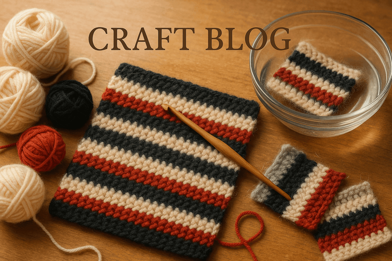
You know that sinking feeling: you finish a beautiful high-contrast crochet piece—maybe cream and navy stripes, black-and-white colorwork, or a graphic border against a pale ground—and for one glorious moment it looks as crisp as you imagined. Then after a bit of handling, blocking, or the first wash, the edges seem softer in all the wrong ways. The white stripe looks slightly gray. A fuzzy dark yarn leaves a whisper of lint on its neighbor. The stitches are structurally correct, but visually the colors are starting to muddy each other.
This is one of those crochet frustrations that doesn’t get enough technical discussion because nothing appears “wrong” in the usual sense. Your gauge may be fine. Your tension may be even. Your stitch counts may be perfect. And yet the fabric loses graphic clarity because the yarn itself is migrating—through loose dye, through fiber shed, through abrasion transfer, or simply through the optical halo that some fibers create when they bloom.
If you love bold stripes, high-contrast motifs, tapestry crochet, intarsia blocks, checkerboards, fair-isle-inspired yokes, or modern minimalist crochet with sharp light-dark transitions, understanding yarn migration is just as important as understanding gauge. A crisp design depends not only on color choice, but on how those colors behave before, during, and after they’re crocheted together.
Let’s dig into why stripe contamination happens, how to predict it, how to swatch for it, and how to choose fibers, stitch structures, and finishing methods that help your crochet stay clean-edged over time.
Why high-contrast crochet is especially vulnerable
When two neighboring colors are close in value—say medium blue and teal—small amounts of transfer or fuzz overlap are often invisible. But when you put black beside ivory, burgundy beside cream, charcoal beside blush, or neon beside white, every tiny bit of migration shows.
There are four major culprits:
- Loose dye bleeding or crocking
- Fiber transfer from shed or abrasion
- Halo overlap from fuzzy or blooming fibers
- Structural blending from stitch geometry and carried yarns
Often more than one is happening at the same time.
A black brushed alpaca stripe against cream wool can contaminate the cream visually even if the dye never bleeds. Why? The halo extends into adjacent stitches and loose fibers catch on the lighter yarn. A dark cotton can contaminate white through crocking while you work if excess dye rubs off onto your hands and neighboring strands. A tapestry section can look muddy because the carried floats show through the front fabric, even when the yarn itself is colorfast.
So the first key mindset shift is this: not all stripe contamination is a dye problem. Sometimes laundering won’t fix it because it’s optical or mechanical, not chemical.
The main forms of yarn migration
1. Dye creep and bleeding
This is the problem most crocheters think of first. If a yarn has excess unattached dye, that dye can release during washing, blocking, steaming, or even heavy dampening. Dark reds, navies, blacks, hot pinks, saturated teals, and some hand-dyed yarns are frequent suspects.
There are two related issues here:
- Bleeding: dye releases into water and can redeposit onto other colors
- Crocking: dye rubs off through friction, often while dry or only slightly damp
Bleeding is more likely to show up during soak blocking or laundering. Crocking may show up while crocheting if the yarn leaves residue on fingers, hook, or neighboring stitches.
Common warning signs:
- Water turns noticeably tinted during swatching or washing
- A paper towel pressed to a damp swatch picks up color
- Your fingers look faintly gray, blue, red, or black while working
- Pale adjacent stitches appear discolored after blocking
2. Fiber transfer and shedding
Some yarns simply shed more than others. Brushed fibers, loosely spun singles, blown yarns, some rustic wools, halo-rich alpaca blends, angora, mohair, and novelty yarns can all release small fibers under abrasion.
Those loose fibers land on neighboring colors—especially smooth, lighter shades where every speck shows. This is not a dye issue; it’s a lint issue.
Common warning signs:
- You can pinch fibers off the yarn surface before crocheting
- Lint collects on your clothing while you work
- The light stripe looks dusty or pilly after handling
- A lint roller removes visible dark fuzz from pale sections
3. Halo overlap and bloom
This is the most underestimated form of “contamination.” A fuzzy yarn does not stay visually inside the exact stitch boundary. Its fibers project beyond the stitch, creating a soft-focus cloud around it. Against a similar color this looks plush and lovely. Against white or cream, it can look like blur or shadow.
Halo overlap becomes stronger after washing if the yarn blooms. Bloom is the way some fibers expand, relax, or fluff after finishing. Woolen-spun yarns, alpaca blends, brushed constructions, and some lofty acrylics can all increase in surface fuzz after laundering.
Even if no fibers break free, the adjacent stripe may no longer look sharply separated because the dark halo encroaches optically.
4. Structural contamination from crochet fabric itself
Crochet stitches aren’t flat pixels. They tilt, stack, and pull neighboring colors into view. This matters a lot in stripes and colorwork.
Structural causes include:
- Carried yarn showing through in tapestry crochet
- Long floats shadowing through open stitches
- Color jogs at round joins
- Uneven tension causing one color to peek into another
- Tall stitches leaning and exposing neighboring rows
- Open or lacy fabric allowing background or carried color to show
This kind of contamination is solved through technique and design choices more than laundering.
Fiber behavior: what yarns are most likely to contaminate their neighbors?
If your goal is crisp graphic contrast, not all yarn categories perform equally.
Lowest-risk yarn types for crisp color separation
These generally behave best:
- Smooth plied cotton
- Mercerized cotton
- Firmly spun wool with low halo
- Smooth superwash wool that has passed swatch testing
- Anti-pill acrylic with a smooth finish
- Cotton-acrylic blends with tight ply and minimal fuzz
Why they work:
- lower surface fuzz
- clearer stitch definition
- less optical blur
- often less shedding
- easier to inspect for dyefastness
Higher-risk yarn types for stripe contamination
Use with extra caution in high-contrast work:
- Brushed alpaca
- Mohair and silk-mohair lace held with another yarn
- Angora blends
- Singles yarns with a hairy surface
- Rustic wool with noticeable vegetable matter or loose guard hairs
- Blown tube yarns with protruding fibers
- Chenille and plush yarns that shed or worm
- Heavily saturated hand-dyed skeins not tested for bleeding
These yarns can make gorgeous projects, but they’re often better in tonal work, low-contrast palettes, allover texture, or garments where soft blending is part of the look.
Why stripe sequence matters more than people expect
The order of your stripes changes how contamination reads. A thin white stripe sandwiched between two dark fuzzy colors is much more vulnerable than a medium gray stripe next to one dark color and one midtone.
A few practical rules:
- The lighter and narrower the stripe, the more any contamination shows.
- White, cream, pale blush, icy blue, and soft gray show transfer fastest.
- Alternating smooth and fuzzy stripes increases visual contrast in edge sharpness.
- Dark-light-dark sequences are riskier than dark-midtone-light transitions.
If you must use a challenging dark yarn, buffer it with:
- a slightly darker light shade instead of pure white
- a separating round or row in a low-risk smooth yarn
- wider stripes that can visually absorb a little edge softness
- textured stitches that interrupt direct side-by-side contact
The swatch test that actually tells you something
Many crocheters make a gauge swatch and stop there. For high-contrast fabrics, you need a behavior swatch, not just a size swatch.
Make a test swatch at least 6 x 6 in / 15 x 15 cm, preferably larger if your yarn is highly saturated or fuzzy. Include the exact colors you plan to combine.
Recommended swatch setup
Use your planned hook and stitch pattern. For many crisp striped fabrics, that may be:
- DK yarn: 4.0–4.5 mm hook
- Worsted yarn: 5.0–5.5 mm hook
- Aran yarn: 5.5–6.0 mm hook
If you want firmer color separation, go down 0.5 mm from the label recommendation, as long as the fabric still drapes appropriately.
Example swatch:
- Chain 31
- Row 1: single crochet in 2nd chain from hook and across = 30 sc
- Rows 2–6: sc in each st across with Color A = 30 sc
- Rows 7–11: sc in each st across with Color B = 30 sc
- Rows 12–16: sc in each st across with Color A = 30 sc
- Rows 17–21: sc in each st across with Color B = 30 sc
This gives repeated contact zones and enough surface area to reveal problems.
For taller-stitch stripe projects, make a second swatch in half double crochet or double crochet because dye/fuzz behavior can read differently in a more open fabric.
What to test
Dry rub test
Rub the dark yarn section against a white cloth or paper towel.
Check for:
- visible dye residue
- released lint or fuzz
Damp press test
Dampen the swatch, sandwich a white cloth or paper towel over the dark area, and press.
Check for:
- color transfer
- strong fuzz release
Soak test
Soak the swatch in cool water with a little wool wash or mild detergent for 20–30 minutes.
Check for:
- tinted water
- discoloration on pale stripes
- increased halo after drying
Agitation test
After soaking, squeeze gently and then lightly rub stripe boundaries together.
Check for:
- pilling n- abrasion transfer
- whether pale sections trap loose fibers
Wear simulation
Carry the swatch in a bag, tuck it in a sleeve, or handle it repeatedly for a day or two.
Check for:
- lint accumulation
- fuzz migration
- whether crisp edges stay crisp under friction
If your yarn fails any of these tests badly, believe the swatch. Don’t assume the full project will somehow behave better.
Choosing stitch structure for clean boundaries
Some crochet fabrics naturally protect contrast better than others.
Best stitch choices for sharp stripes
Single crochet
Single crochet is often the strongest choice for crisp edges because the fabric is dense and minimizes show-through.
Pros:
- compact structure
- good for graphic motifs
- carried yarn is easier to conceal than in taller stitches
- stripe changes feel more controlled
Cons:
- dense fabric may increase surface abrasion in some yarns
- row color transitions can still slant visually
Waistcoat stitch / center single crochet
This can create very neat color blocks, especially in firm tapestry-style fabrics.
Pros:
- stacked, almost knit-like look
- excellent color coverage
- very graphic
Cons:
- requires looser hands or larger hook to avoid stiffness
- can exaggerate abrasion if too tight
Tunisian simple stitch
Though technically a different branch of crochet, Tunisian can produce very crisp color fields because the vertical bars create dense visual coverage.
Pros:
- less color peeking through in many cases
- clean graphic motifs
Cons:
- curling and finishing considerations
- different tools and tension behavior
More challenging structures for high contrast
Double crochet stripes
Double crochet works beautifully, but the taller stitches create more visual blending at color changes.
- The tops of stitches read into the next row
- Dark yarn can visually shadow lighter rows
- Open spaces may reveal carried strands or background
If using dc stripes, choose especially smooth, non-fuzzy yarns and test laundering carefully.
Lacy or mesh fabrics
Openwork magnifies contamination because neighboring colors are seen through gaps, and any carried yarn becomes obvious.
Puff, boucle, brushed, or loop textures
Texture can be beautiful, but it often broadens the contact zone between colors and traps shed fibers.
Carrier management in colorwork
A lot of so-called contamination is really poor carrier control.
In tapestry crochet, the unused yarn is carried inside stitches. If the contrast is high, a dark carrier behind a pale stitch can make it look gray even if no dye transfers at all.
To reduce carrier show-through
- Use a smaller hook for a denser fabric
- Keep the carried yarn relaxed but not loose
- Avoid carrying very dark yarn behind white over long distances
- Drop and rejoin instead of carrying if the span is too visible
- Match carrier strategy to background color zones
- Test from both right side and wrong side in bright light
A useful rule: if you can see the dark carried yarn through the fabric before washing, laundering will not solve it.
For especially crisp motifs, consider bobbins, butterflies, or separate small lengths rather than carrying high-contrast yarn across pale areas.
Step-by-step: designing a high-contrast crochet fabric that stays crisp
Here’s a practical workflow you can use whether you’re designing a striped scarf, a checkerboard pillow, a colorwork bag, or a bold garment yoke.
Step 1: Start with the right yarn category
Pick the smoothest version of your desired fiber that still fits the project.
For crisp results, good pairings include:
- mercerized cotton + mercerized cotton
- smooth wool + smooth wool
- anti-pill acrylic + anti-pill acrylic
- wool-cotton blends with low halo
Avoid pairing:
- fuzzy dark yarn + smooth white yarn
- heavily shedding novelty yarn + pale matte yarn
- hand-dyed dark skein + undyed cream without testing
Step 2: Build a contrast plan, not just a palette
Don’t stop at “these colors look good together.” Ask:
- Which stripe is most vulnerable?
- Which yarn is the shedder?
- Which yarn is likely to bleed?
- Which color shows transfer most?
- Are there ways to insert a buffer color?
Example sequence:
Risky: black / white / black / white
Safer: black / stone / white / stone / black
That stone buffer often makes a huge difference in how clean the white appears over time.
Step 3: Make a behavior swatch in the actual stitch pattern
If your project is worked in hdc in the round, don’t test only flat sc rows. Match reality as closely as possible.
For a round stripe swatch, for example:
- Chain 36, join without twisting
- Round 1: 1 sc in each chain around = 36 sc
- Rounds 2–5: sc around in Color A = 36 sc
- Rounds 6–9: sc around in Color B = 36 sc
- Repeat once more
This helps you evaluate jogs, carried joins, and friction at round boundaries.
Step 4: Launder the swatch the way the finished object will be treated
If the project is a baby blanket, test repeat laundering. If it’s a wall hanging, test steaming and dusting. If it’s a sweater, test body-friction scenarios.
Don’t skip drying behavior. Some halos bloom dramatically only after drying.
Step 5: Adjust hook size and density
If carriers show through or fibers drift between stitches, tighten the structure slightly.
Typical adjustment:
- from 5.5 mm to 5.0 mm for worsted
- from 4.5 mm to 4.0 mm for DK
Recheck drape and stitch counts after changing hook size.
Step 6: Choose your color-change method intentionally
For cleaner row transitions:
- Complete the last yarn-over of the final stitch with the new color
- Keep the first stitches of the new row snug but not pinched
- In joined rounds, consider invisible joins or jogless stripe techniques
Inconsistent changeovers create little dark/light nicks that read as contamination from a distance.
Step 7: Manage floats or carriers ruthlessly
If a dark carrier muddies pale sections, stop carrying it there.
Instead:
- use separate bobbins
- catch floats only where they stay hidden
- rejoin strategically at color blocks
- hide tails in matching-color zones only
Step 8: Finish with minimal friction and smart washing
At finishing, avoid rough towel rubbing, aggressive steaming, and high-agitation washing. These can all increase transfer, pilling, and halo spread.
Finishing methods that preserve crisp contrast
Washing
Best practice for uncertain yarns:
- wash cool
- use a mild detergent or wool wash
- avoid long hot soaks for saturated colors
- wash similar depths together
- do not let a wet dark section rest folded onto a pale section for hours
If hand washing:
- immerse gently
- avoid scrubbing stripe boundaries together
- rinse thoroughly
- support the fabric fully when lifting
Color catcher sheets
For machine-washable projects, color catcher sheets can help capture loose dye during early washes. They are not magic, but they can reduce redeposition risk.
Drying
- Roll in a towel; don’t grind the towel against the fabric
- Reshape flat
- Keep dark wet sections from sitting directly on pale ones in a crumpled heap
- Avoid high heat if it increases bloom or fuzzing
Brushing and steaming
If your goal is crisp graphic edges, be careful with finishing techniques that intentionally raise the nap.
- Brushing will almost certainly worsen halo overlap.
- Heavy steaming can relax fibers into a softer, blurrier edge.
- Light steam from a distance may be fine for some smooth yarns, but test first.
Troubleshooting common problems
Problem: My white stripe turned gray after one wash
Possible causes:
- dark yarn bled in wash water
- dark carrier showed through more after bloom
- lint redeposited onto pale stitches
Fixes:
- rewash promptly with cool water and a color catcher
- isolate and remove loose lint with a lint roller once dry
- for future projects, test swatches more aggressively and avoid carrying dark yarn behind white
Problem: No dye bled, but the edges still look blurry
Possible causes:
- fuzzy halo overlap
- blooming after laundering
- tall stitch structure blending colors visually
Fixes:
- switch to smoother yarns
- choose denser stitches such as sc instead of dc
- add a buffer color or textured separator row
- embrace lower-contrast pairings when using halo-rich fibers
Problem: Dark fuzz keeps sticking to pale sections during use
Possible causes:
- shedding fiber
- abrasion from wear
- loosely spun yarn surface
Fixes:
- gently lint-roll the finished item
- trim only obvious pills; do not shave aggressively unless tested
- reserve that yarn for single-color or tonal projects next time
- choose a more tightly spun alternative in future
Problem: Tapestry crochet looks muddy even before washing
Possible causes:
- carrier show-through
- hook too large for the yarn and technique
- tension too loose
Fixes:
- size down hook by 0.5–1.0 mm
- keep unused yarn behind work only where hidden
- use separate bobbins for high-contrast sections
- try waistcoat stitch or tighter sc fabric
Problem: My joins in striped rounds look contaminated on one side
Possible causes:
- standard jog in color transition
- inconsistent first stitch tension
- carried yarn peeking near join
Fixes:
- use jogless stripe methods
- pull first new-color stitch snugly into place
- place join where it is least visible
- avoid fuzzy yarns in very narrow round stripes
Design variations that work with, not against, yarn behavior
Sometimes the smartest strategy isn’t fighting the yarn—it’s choosing a design that suits it.
Variation 1: Use tonal contrast instead of extreme contrast
If you adore a fuzzy charcoal alpaca, pair it with pewter, mushroom, or heather gray rather than bright optic white.
Result:
- softness looks intentional
- halo reads as atmosphere instead of contamination
- shed fibers are less obvious
Variation 2: Separate colors with a “barrier” yarn
Insert one round or row of a stable, smooth medium shade between two risky colors.
For example:
- black / camel / cream
- burgundy / taupe / blush
- navy / denim / ivory
This can dramatically reduce the visual shock of edge softening.
Variation 3: Use texture to compartmentalize color
A rib, slip-stitch ridge, surface crochet line, or post-stitch channel can physically and visually divide colors.
Ideas:
- work a slip-stitch surface line at stripe boundaries
- insert a row of back-loop-only sc to create a ridge
- use front-post stitches as a dividing column in color blocks
These don’t stop dye bleed, but they can reduce perceived contamination from halo and structural blending.
Variation 4: Put risky yarns in isolated motifs
Instead of broad adjacent stripes, use the fuzzy or dark yarn as:
- appliqué on top of a stable base
- edging away from pale interiors
- separated motifs joined later
- cuffs, collars, or borders not directly touching the palest fabric
Variation 5: Line the project
For bags, baskets, pillows, and some garments, a fabric lining won’t solve external halo, but it can reduce internal abrasion, support shape, and limit some transfer from carried floats rubbing through the back side.
Recommended project planning by yarn weight
Fingering and sport weight
Best for:
- fine graphic motifs
- lightweight garments
- detailed colorwork
Recommended hooks for crispness:
- 2.75–3.5 mm, depending on yarn and technique
Notes:
- excellent for precision if yarn is smooth
- mohair-held-together combinations are risky for sharp contrast
DK weight
Best for:
- scarves, garments, pillows, baby blankets
- balanced drape and definition
Recommended hooks for crispness:
- 4.0–4.5 mm in many smooth yarns
Notes:
- often the sweet spot for graphic crochet
- still test dark hand-dyes thoroughly
Worsted/aran weight
Best for:
- bold modern stripes
- bags, afghans, outer layers, cushions
Recommended hooks for crispness:
- 5.0–6.0 mm depending on density desired
Notes:
- large stitches magnify halo and contamination visually
- smooth plied constructions outperform hairy yarns here
Bulky and super bulky
Best for:
- statement stripes with smooth yarns
Recommended hooks for crispness:
- as small as practical for the yarn while preserving hand feel, often 6.5–9.0 mm
Notes:
- fuzz and bloom become extremely visible at this scale
- crisp black-and-white effects are harder to maintain with plush yarns
Common mistakes and how to avoid them
Mistake 1: Trusting the ball band without testing
“Colorfast” on paper doesn’t tell you how a specific lot behaves against white in your chosen finish.
Better: always test the exact color pairing.
Mistake 2: Using pure white as the contrast color with every dark yarn
Pure white is unforgiving.
Better: consider cream, oat, parchment, stone, or soft gray if the dark yarn has any halo or dye risk.
Mistake 3: Carrying black behind ivory because it’s “easier”
Ease during stitching often creates disappointment later.
Better: use bobbins or strategic rejoining in pale zones.
Mistake 4: Choosing taller stitches for a motif that needs hard edges
Double crochet and open stitches can be lovely, but not always precise.
Better: use sc, waistcoat stitch, slip stitch, or Tunisian for cleaner graphics.
Mistake 5: Over-handling the swatch gently and the project roughly
A delicate swatch test doesn’t predict real-life use.
Better: simulate wear, washing, and friction honestly.
Mistake 6: Blocking aggressively to “fix” a fuzzy boundary
Aggressive finishing often amplifies the blur.
Better: finish minimally and let yarn choice do the work.
A realistic expectation: crisp is a materials decision
We often talk about high-contrast crochet as if it’s purely a color-design achievement. But the cleanest stripes are really the result of three things working together:
- appropriate fiber selection
- appropriate stitch structure
- appropriate finishing and care
Technique can improve a lot, but it cannot turn a bleeding brushed black alpaca into a razor-sharp white-and-black graphic yarn. In the same way, the right smooth cotton or firm plied wool can make even simple stripes look polished and intentional with very little effort.
That’s the empowering part. Once you know what causes contamination, you can predict it and prevent much of it before the first row of the project.
Takeaways for keeping high-contrast crochet crisp over time
If you want your crochet fabrics to stay sharp and graphic, remember these core principles:
- Choose smooth, low-halo yarns for the highest contrast work.
- Treat dark saturated colors and fuzzy fibers as separate risks; one may occur without the other.
- Make a behavior swatch, not just a gauge swatch.
- Test for bleeding, crocking, shedding, bloom, and carrier show-through.
- Use dense stitch structures when edge clarity matters.
- Avoid carrying dark yarn behind pale sections in high-contrast colorwork.
- Sequence stripes so vulnerable light shades aren’t trapped between risky darks.
- Finish gently and wash in ways that minimize friction and dye redeposition.
- If a yarn wants to blur, design with that softness in mind instead of forcing a crisp result.
In other words, crisp crochet isn’t luck. It’s observation, testing, and a willingness to match the yarn to the visual job you’re asking it to do.
And once you start looking at yarn this way—not just by color, but by surface behavior—you’ll make stronger choices from the very beginning. Your stripes will stay cleaner, your motifs sharper, and your finished pieces will keep that satisfying snap of contrast that first inspired you to make them.